sitelen pona
“sitelen pona” (“simple writing” or “good writing”) is a logographic writing system designed for toki pona by its creator, Sonja Lang.
The part of the official book describing sitelen pona was published with a non-commercial CC-BY-NC 4.0 license. Hence, it’s easily available online in other courses, such as jan Pije’s page on the system, which describes it almost exactly the same as the official book.
logographic systems
In a logographic system, each character generally represents one word (or sometimes even a phrase). The most commonly known example of a logographic system are the Han characters, used in Chinese and (in addition to their own writing systems) Japanese and Korean.
Logographic systems are well-suited for languages in which words have little to no inflection (change very little, if not at all, based on grammar), and the grammar is instead based around putting existing words together (such a language is called “isolating”). Chinese languages fit that idea really well, as does toki pona.
But since toki pona’s basic dictionary only uses 120 words (plus a few community additions), a logographic system for toki pona also becomes significantly easier to learn and use than that of Chinese, which requires knowing at least 1500 characters to achieve fluency. In addition, most characters in sitelen pona visually represent the words they mean – for example, “lawa”, meaning “head”, is literally a symbol of a head with a cap on. “nanpa”, meaning “number”, is based on the “#” number sign, and so on. (To some extent, the same is true for a number of Han characters as well.)
sitelen pona chart
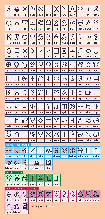
This table shows all the sitelen pona characters used for the 120 official words, the important words in the second official book (“nimi ku suli”), as well as some characters commonly used for additional words (“nimi sin”) and alternative representations (“nasin lukin ante”). Some of the alternate characters are my original designs – these are indicated with a small red triangle in the bottom-right corner.
Much like the Latin alphabet, it is written left-to-right and top-to-bottom. Each toki pona word is written using its character, without extra spaces between words.
An adjective character can be put inside or over/under a noun character to represent a noun phrase. Such a character is generally called a “composite character”.
You might notice that toki pona’s “logo”, used on the cover of the official book and on most websites to represent it (including this one), is, in fact, sitelen pona’s composite character for “toki pona”, with the “pona” symbol written inside the “toki” symbol.
Unofficial words are written inside a cartouche (a rounded shape that surrounds all the characters), with characters for words that start with their first letters. For an example, in the page linked at the beginning (and used in the official book), “ma Kanata” is written as “ma [kasi alasa nasin awen telo a]”. (In some fonts, the cartouche may be replaced with parentheses or brackets between the characters.)
sitelen pona as commonly used
The information in this part is not part of the official design of sitelen pona. It is based entirely on how sitelen pona is used by the toki pona community.
Sentences are separated either with a dot or with a space. All other punctuation (commas, colons, etc.) is either omitted or written as their corresponding characters (since in practically all cases, their presence or absence doesn’t change the meaning of a sentence).
Words added by the toki pona community usually have their own separate characters and are not written as unofficial words.
Since the question mark is used as the character for “seme”, question sentences may be ended with a period (or a smaller question mark) instead.
Some people use composite characters within cartouches to write entire syllables in a single space. For example, this tweet shows the unofficial word “Nijon” (“Japan”) written as three characters: “nena-ilo”, “jan-oko” and “nena”.
Others use a different system: they put a single dot after a character inside a cartouche to mean the word’s first syllable and two dots (typically in a colon-like formation) to mean the entire word’s pronunciation. So, for example, “jan Mawijo” can be express as “jan [mama·wile·jo·]” and “jan Kilili” can be “jan [kili:lipu·]” or “jan [kili·lili:]”.
It’s worth noting that in both of these systems, the final “n” sound is treated as a syllable on its own. For example, the word “nanpa” is broken down into “na”, “n” and “pa”.
Examples
Here’s some basic text written in sitelen pona.

For some other texts written in sitelen pona, including a page that tries to teach someone to read it without using any other writing system, check out the website “tomo pi sitelen pona” by jan Tepu.
Fonts
The text above is displayed using a font called “linja pimeja”. However, for displaying sitelen pona text online, there is a ton of other options. Here are the most common ones.
A font called “linja pona” is characteristic for its basic design and support for tons and tons of different composite characters. It used to be the most popular option.
“sitelen sa (previously “sitelen pona pona”)” is a font that features some characters way different from regular sitelen pona, but looks very nice on different font sizes and doesn’t require any modification to toki pona text in order to look good. In particular, this is my favorite font.
Some pages on this website may offer an ability to toggle between Latin and sitelen pona displays. The latter option will use the “sitelen sa” font, since it works best with unmodified toki pona texts and falls back nicely in texts that use non-pu, unofficial or outright non-toki-pona words in them.
“linja suwi” is a recently-designed font by alienpirate5. It features nicely-drawn characters and lots of community-created words.
I have also designed a font for sitelen pona, called “insa pi supa lape”. It is based on the font “Bedstead”(hence the name) and uses the same algorithm to convert small bitmaps of different characters into a fully-functional vector font.
“nasin sitelen pu” uses the sitelen pona glyphs as shown in lipu pu.
“nasin nanpa” is a font designed by jan Itan. It is used in the first lipu su (The Wonderful Wizard of Oz) and (will be) in later versions of lipu pu.
Other popular fonts:
- “sitelen seli kiwen”, a handwritten font by jan Lepeka
- “linja lipamanka” by lipamanka
- “Fairfax HD” also by jan Lepeka
- “Nishiki-teki” by Umihotaru
- “leko majuna sin”, a pixel font by waso Keli
You can browse and preview many other fonts in this website.
You can also use waso Keli’s SP Font Maker or follow this video tutorial to create your own font!
Examples of different fonts
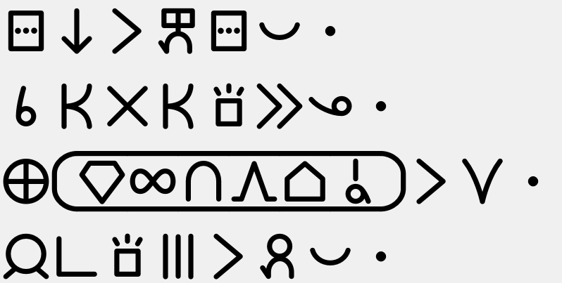
sitelen ni li sitelen kepeken sitelen pona.
sina ken ala ken sona e ona.
ma Kanata li suli.
jan pi sona mute li pali pona.
- linja pona:
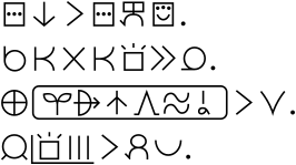
- linja pona (syllables using composite characters):
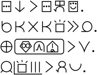
- linja pimeja:
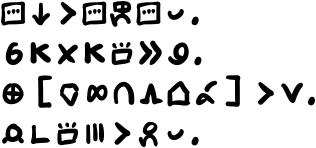
- sitelen sa:
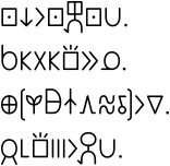
- insa pi supa lape:
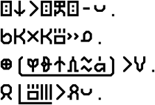
- nasin sitelen pu:
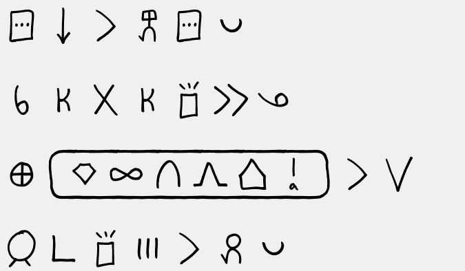
- nasin nanpa:
sitelen pona in Unicode
At this moment, toki pona has not been recognized by Unicode officially (though efforts to make this happen are in progress). Most fonts designed for sitelen pona use ligatures in order to convert Latin-based toki pona text into sitelen pona. However, the toki pona community submitted a proposal to encode sitelen pona to the Under-ConScript Unicode Registry, an unofficial project to coordinate using parts of the Private Use Areas to writing systems for constructed languages. Said proposal has been accepted, and, as a result, many newer toki pona fonts now try to use the same range of characters.
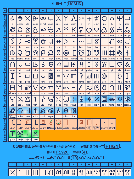
Description of sitelen pona in UCSUR
If you want to find the codepoint (character number) for a character, take the large number on the left, the small number on the top and add the two. For example, the character “lawa” has the number F1924. The number on the side is F1920 and the number on the top is 4. These are base-sixteen numbers. “10” doesn’t mean ten, it means sixteen.
sitelen emoji / sitelen pilin & nasin pi sitelen jelo
A system called “sitelen emoji” (or “sitelen pilin”) adapts sitelen pona by using an emoji character for each of the possible sitelen pona characters. This makes it possible to use in most web browsers and messenger apps.
To address issues such as accessibility for colourblind and dark mode users, female diminutization, etc, waso Keli has designed another emoji-based system called “nasin pi sitelen jelo”. This may be the more predominant emoji-based writing system within Discord communities and newer websites, though both systems are still relatively rare.